Color has the power to transform how you move through your space, how you interact with your surroundings, and how you express your personal style. When you understand the science behind paint tones, you can shape an atmosphere that feels aligned with what you want each room to evoke.
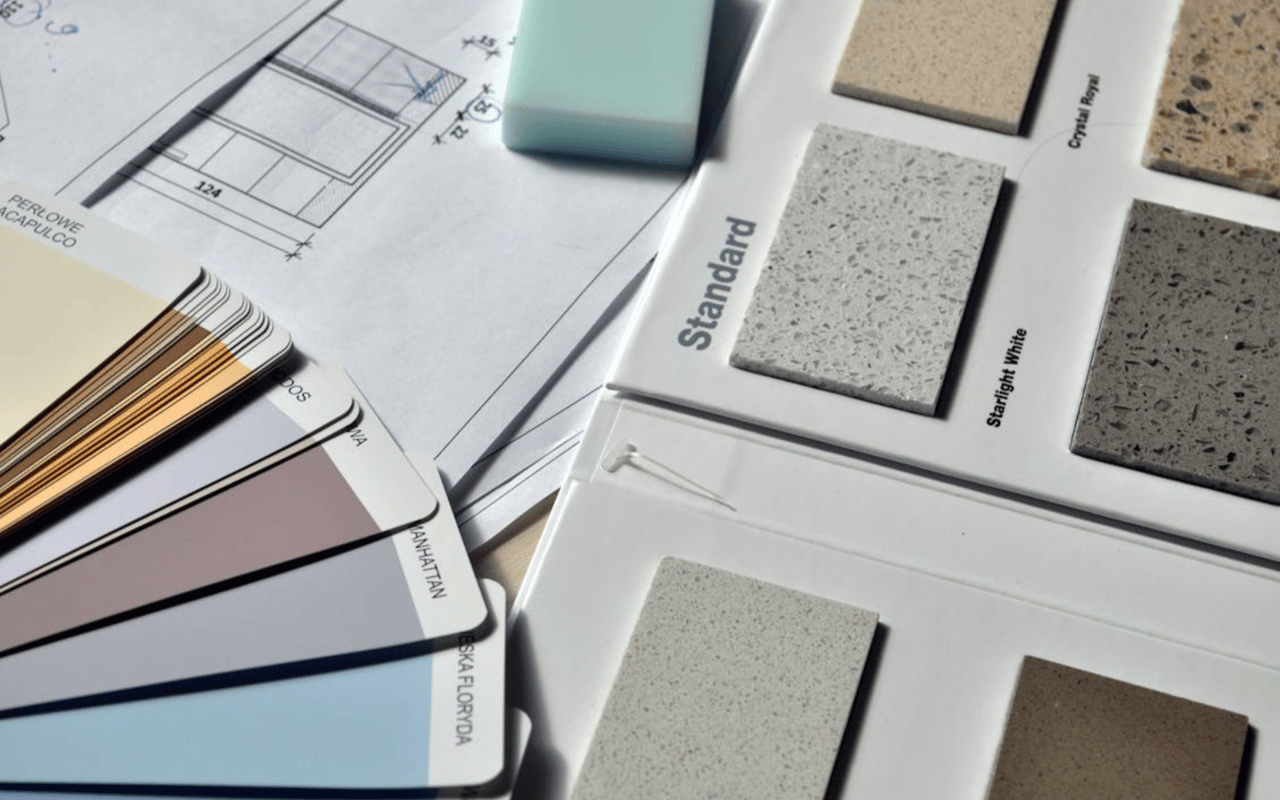
If you’ve ever brought home a paint sample that looked entirely different compared to what you had expected, you already know that paint is more complex than a simple swatch on a shelf. Color selection often feels intuitive, but it’s important to understand how light, undertones, and finish types impact the final result.
Whether you’re refreshing a single wall or planning a whole-home repaint, you need clarity about how different shades behave, how they influence energy, and how you can use them with confidence.
Understanding the Science Behind Color Tones
Paint tones are rooted in both color theory and the way light interacts with pigment. When you place a color on your wall, you’re not just seeing the hue itself; you’re seeing a combination of reflected light, undertones, and how your eyes interpret the information.
This is why the same paint color can appear cool in one room and warm in another. The science behind color helps you anticipate these shifts so that you can choose tones that perform beautifully throughout the day.
Color theory explains how primary, secondary, and tertiary colors influence one another and how balance is achieved. When you understand how hues work together, you can create combinations that feel harmonious and intentional. For example, colors opposite each other on the color wheel — known as complementary colors — naturally enhance each other. When placed near one another, they create visual interest that feels dynamic. In contrast, analogous colors, which sit side by side on the wheel, create a gentle, soothing flow.
The Impact of Natural and Artificial Light
Light is one of the most powerful influences on how paint tones appear within your spaces. Sunrise light tends to carry a warm glow, midday light is brighter and more neutral, and late-afternoon light often deepens tones. When choosing paint, it’s important to observe how samples look during each phase, as the shifts can be subtle or dramatic, depending on the hue.
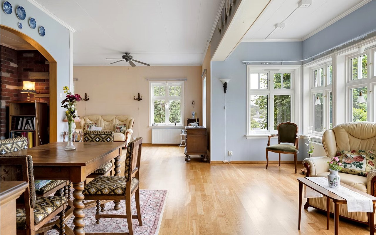
North-facing rooms tend to receive cooler light, which means warm tones often perform beautifully by providing a sense of softness. These colors balance out the cooler natural tones in a way that helps the room feel more inviting. On the other hand, south-facing rooms receive stronger sunlight for a longer portion of the day. Because of this, many colors look vibrant and full of life, allowing you to experiment with both darker and lighter options without worrying that the shade may appear dull.
Artificial lighting also shapes the outcome. Warm bulbs enhance golden, beige, and earthy tones, making them appear richer. Cool-toned bulbs emphasize blues, greens, and grays, giving them a cleaner, crisper look.
If you prefer an ambiance with depth, warm bulbs will help your walls feel more layered. If you prefer clarity and brightness, cooler lighting can help you achieve that effect. Many homeowners use a mix of lighting types throughout their rooms for a dynamic impact.
Choosing Warm or Cool Undertones
Every paint color contains undertones — even those that initially appear neutral. These undertones are subtle hints of color, such as pink, blue, yellow, or green, that shape the character of the shade. When you’re selecting shades for your home, identifying undertones helps you keep your color palette cohesive so each room flows effortlessly into the next.
Warm undertones include hints of red, orange, and yellow. These tones tend to feel comfortable, glowing, and inviting, especially in spaces where you want to relax or unwind. They interact well with natural wood, stone accents, and soft textures. If you’re choosing a shade of white, for example, a warm undertone will help the room feel balanced rather than stark.
Cool undertones have hints of blue, green, or purple. These tones bring a refreshing and airy atmosphere to your spaces. Many homeowners choose cool tones for areas where they want clarity or a crisp backdrop for décor. Cool tones also tend to feel serene, making them a great option if you want your room to feel calm, polished, and uncluttered.
When evaluating undertones, look at your paint sample next to materials already in the room, like flooring, countertops, tile, or furniture. This comparison reveals whether the undertone complements your existing elements. Undertones that clash can alter your perception of the space, while undertones that align create a sense of harmony.
Creating Flow
Your home gains a sense of cohesion when paint tones connect from one space to another. This doesn’t mean that all rooms need to incorporate identical colors; instead, the goal is to select hues that relate to one another and feel like part of a unified vision. When you create this visual continuity, your rooms feel purposeful and naturally connected.
One way to achieve this sense of flow is by choosing a base color that appears in more than one room. This doesn’t have to be a dominant shade; even using it on a trim, accent wall, or piece of décor can help connect your spaces. Once your base color is selected, you can build a palette by choosing complementary shades or neighboring tones on the color wheel. This approach gives each room its own personality while maintaining a consistent theme.
Transitions matter as well. If you stand in a hallway and look toward multiple rooms, you want the colors to feel coordinated rather than abrupt. Lighter tones often help with transitions because they blend smoothly with a variety of shades.
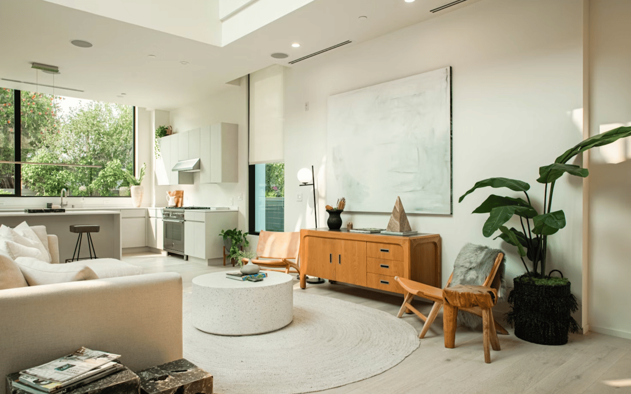
Exploring Neutrals With Depth
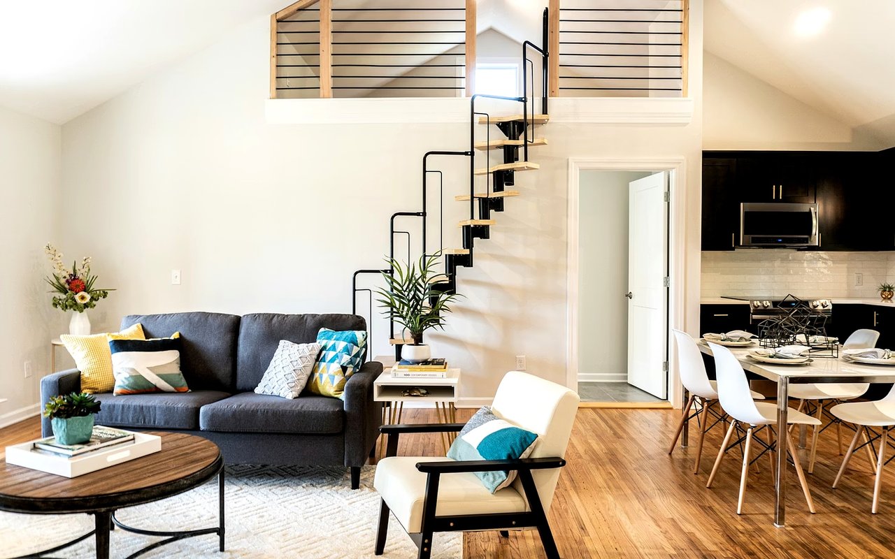
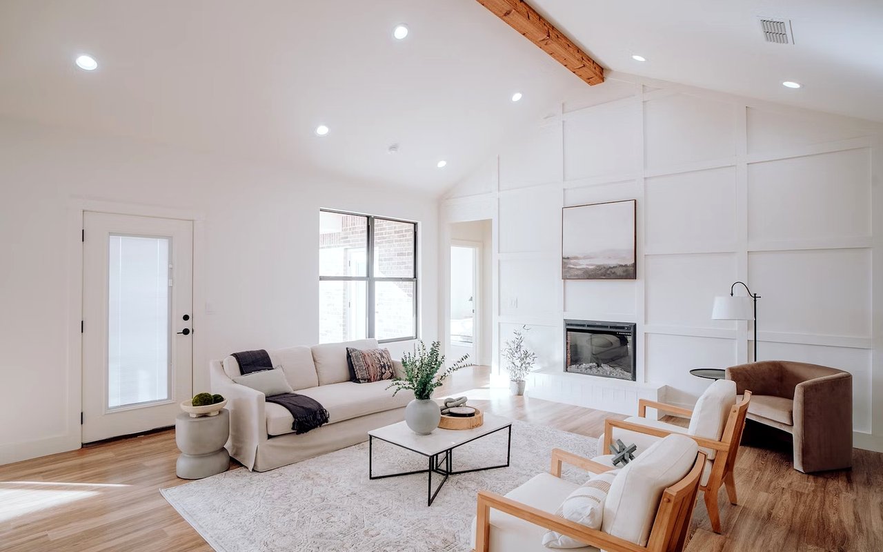
Neutral paint tones offer a versatile foundation that works wonderfully with nearly any design style. Neutral doesn’t mean plain or boring; in fact, many neutral colors contain complex undertones that create dimension and visual interest. When choosing a neutral, you want to evaluate the shade in various lighting conditions to understand how its undertones emerge throughout the day.
Beige, greige, cream, taupe, and subtle earthy tones all fall into the neutral category. Each one can be tailored to match your style and the look you want to achieve. For instance, warm beige tones pair well with natural textures and cozy fabrics, while greige offers a more contemporary feel. Cream tones work beautifully when you want a soft backdrop that still feels lively and bright.
If you love a modern aesthetic, soft gray tones with balanced undertones can provide a clean, elegant foundation. These shades work well with either bold or muted décor, giving you flexibility to refresh your styling over time. Many neutrals also perform well in open-concept layouts, where you want colors to feel harmonious across a shared space. Because neutrals complement such a wide variety of materials, they remain a timeless choice.
Using Bold Colors With Confidence
Bold colors allow you to express creativity and personality in a way that feels energizing and memorable. The key to choosing bold tones is understanding how saturation and depth influence your experience of the room.
Vibrant blues, rich greens, deep burgundies, and dramatic charcoal shades can create stunning focal points. These colors are especially striking in rooms with abundant natural light because the illumination emphasizes the richness of the pigment.
If you’re exploring bold options, consider starting with a single wall or a smaller room where the color can make an impression without overwhelming the space. You can also incorporate bold colors on built-ins, cabinets, ceilings, or interior doors. These applications add character and depth in a way that feels artistic and intentional.
Finish and Sheen
The finish you choose influences how your paint looks and how light interacts with the surface. Flat and matte finishes absorb more light, creating a smooth, velvety appearance. These finishes are perfect when you want a soft backdrop that minimizes glare. Because they provide a quiet, elegant look, many people use them in living rooms, bedrooms, and spaces where they want an understated feel.
Eggshell and satin finishes offer a subtle sheen that reflects just enough light to give the walls a soft glow. These are popular choices because they strike a balance between matte and glossy.
Semi-gloss and high-gloss finishes reflect the most light, creating a polished, luminous effect. These finishes are ideal for trim, doors, and cabinetry. If you love a modern, sleek look, incorporating glossy finishes can help you achieve it.
Coordinating Paint With Décor and Finishes
Your paint color should complement the materials and furnishings already in your home. When evaluating tones, consider how they interact with furniture, artwork, metals, and natural elements within your space.
If you have vibrant décor pieces, such as patterned rugs or colorful artwork, you may want a more neutral paint tone that allows these items to stand out. A soft beige, cream, or muted gray can create an elegant backdrop that highlights your favorite accents. On the other hand, if your furnishings are more understated, using a bolder wall color can give the room dimension and personality.
Wood tones also play a major role in color selection. Light oak complements both warm and cool tones, while richer woods pair beautifully with deep, saturated colors. Metal finishes, such as brass, chrome, or brushed nickel, can also influence how your paint appears. Warm metals enhance earthy tones, while cooler metals pair well with crisp blues, grays, and charcoals.
Bringing It All Together
Color has the power to tell a story in your home, and when you understand the science behind paint tones, your choices become more intuitive. Let your creativity guide you, trust your instincts, and enjoy the process of designing a home that feels vibrant, inviting, and entirely your own.
If you’re ready to find a home you love in Roswell,
The Cole Realty Group is by your side. Reach out today.